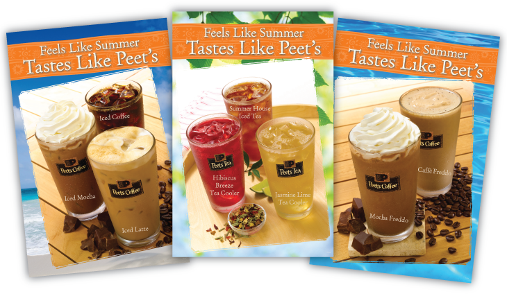
Peet’s introduced several refreshing beverages for Summer 2011 and our strategy was to produce in-store materials that highlighted these drinks with a light, refreshing look. The traditional rich colors Peet’s uses were replaced with bright, fruit-like colors that allowed the posters and print materials to really “pop” in the Peet’s store environment.
