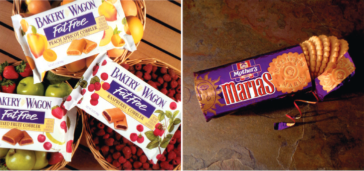
Mother’s Cake and Cookie Company developed this great tasting fruit filled snack. Our objectives were to visually promise the exceptional taste that the product delivers and to clearly communicate the fat-free benefit. The strong brand identity color of purple we established for all Bakery Wagon products was used to boldly focus the attention on the fat free message. Clean and simple, photo realistic illustrations convey the appetite appeal and differentiate the flavors. Even the description “Cobblers” works hard in comparative appetite appeal versus the familiar “Newtons.”
As a staple in Hispanic cultures, Marias Biscuits are consumed by all members of the family. Mother’s wished to meet this very large market demand with its simple, high-quality version of the Marias Biscuit. Our design which primarily targeted the Hispanic market uses a deep, rich purple metallic background to nicely contrast the sun icon in a high-quality manner. The festive logotype creates the spirited, all-family personality of the brand.
