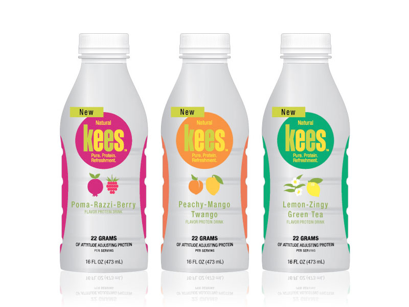
KenCreative developed the name, logo and package design for kees. Each bottle contains 22 grams of 100% pure whey protein isolate to improve mental acuity, boost endurance and recovery time, support weight management, and more.
The name “kees” is based off the traditional Chinese word “ki” meaning “vital energy.”
The three bottles have a bright color palette and simple, yet descriptive illustrations of each flavor. In addition, the silver background and matching layouts of the packaging creates a cohesive look for the line as a whole. The oval color on the sides of the package gives the impression of a sports bottle to appeal to a health-conscious and energetic customer base. The combination of a bright logo, energetic packaging, and a vibrant name led to successful introduction of kees into Nevada’s market.
