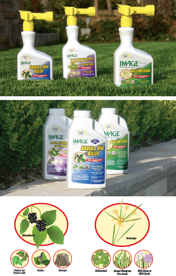
KenCreative updated the Image packaging to make the labels contemporary, simple, and easy to read. Our designs place greater emphasis on each product’s specific use, creating a premium-quality brand personality. All product labels feature a new color palette and a silver metallic ribbon that falls behind the product name and illustration. To show examples of the herbicides’ targeted weeds, our studio created detailed illustrations based on our study of the species controlled by the products.
