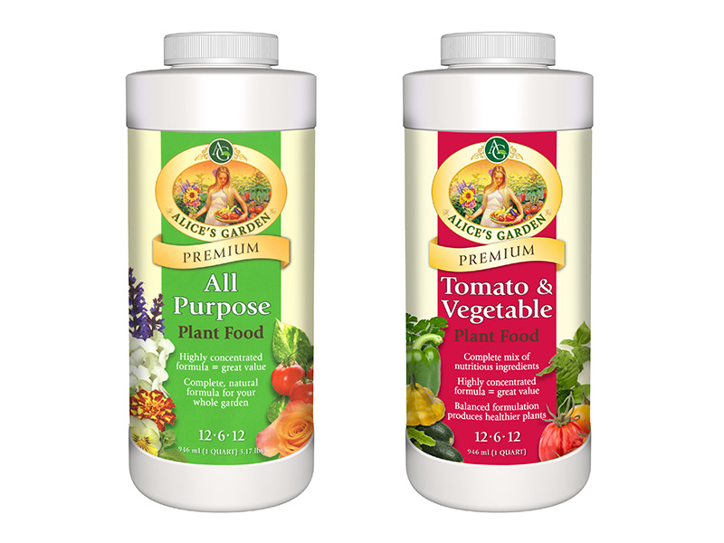
KenCreative redesigned the logo and product packaging for General Hydroponics’ Alice’s Garden fertilizer to appeal to independent garden center consumers. The Alice’s Garden logo was refreshed to create a sense of a vibrant and lively garden, and gold trim was added to communicate the product’s premium positioning and recipe.
A vertical color bar is used on the front panel to allow for planned product extensions and future color differentiation. Featured along the color bar are fresh vegetables, fruits and flowers to show the effectiveness of the fertilizer, as well as key bullet points highlighting the main product benefits.
