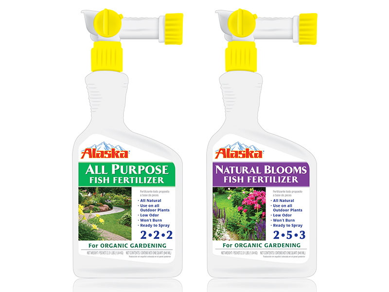

Fish fertilizer has been used for generations to guarantee healthy plant growth and abundant harvests. Alaska wanted to improve their previous packaging, and sought assistance from KenCreative for an improved design to attract customers who would normally purchase traditional fertilizers.
The existing packaging did not contain product-specific images and the text was difficult to read. KenCreative wanted to ensure that the new packaging needed to unify the product line, provide clear and necessary information about the specific product and assure the customer that the product yields great results.
KenCreative produced an engaging and information-rich new package design. The copy is informative and presented visually in order of importance. The new images are bright, full of life and give the customer an idea of how Alaska’s products could improve their garden. Lastly, individual fertilizer product was defined by a strip of color which distinguished one type from another, and gave the complete line a unified feel.
KenCreative also refreshed the Alaska logo design to reflect the brand’s organic formula and appeal to the environmentally-conscious gardener. The mountain graphic illustrates the Alaska name as well as highlights the brand’s natural promise. A brighter and more contemporary take on the previous red lettering keeps the logo recognizable to loyal buyers while also promoting shelf-appeal to attract new ones. Featured across the line of fertilizer packaging, the refreshed logo design unifies the Alaska brand.
