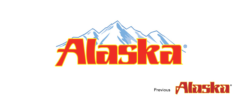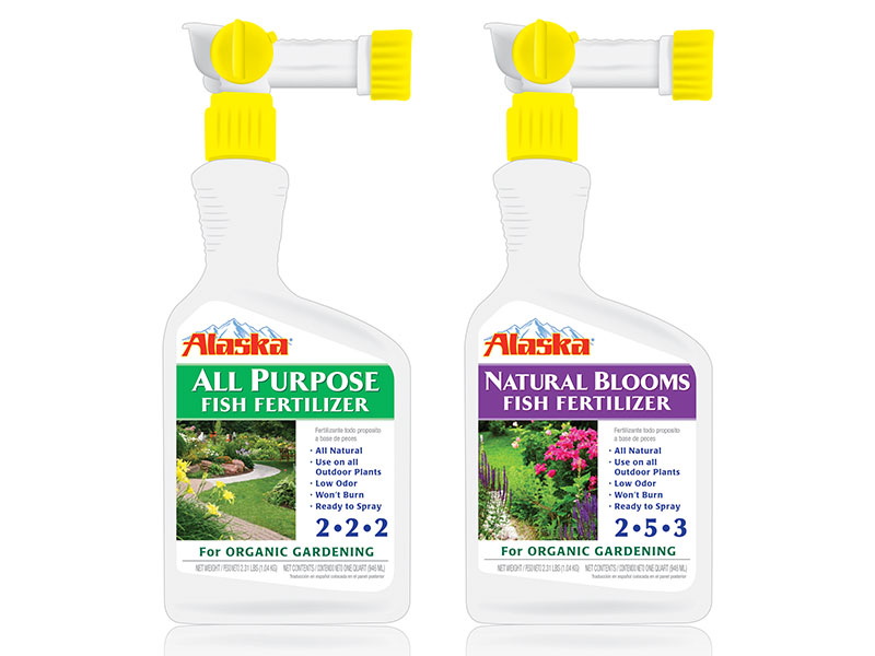

A leader in fish fertilizers, Alaska prides itself on its unique, organic, and nutrient rich garden products. However, Alaska needed to refresh its image and to project impressions of openness, life and air through their logo.
To reflect Alaska Garden Product’s organic formula and appeal to the environmentally conscious gardener, KenCreative was selected to design a fresh, natural and honest logo. With such a rich and prosperous history, it was also important to maintain Alaska’s brand equity in the redesign in order for the brand to remain familiar to its loyal customers.
Through illustrative and smart additions, KenCreative produced a lively and engaging logo design. The mountain graphic, which emphasizes the Alaska name, highlights the brand’s natural promise and draws the viewer’s eye upward. Additionally, a brighter and more contemporary take on the previous red lettering keeps the logo recognizable to loyal buyers while also promoting shelf-appeal to attract new buyers.
